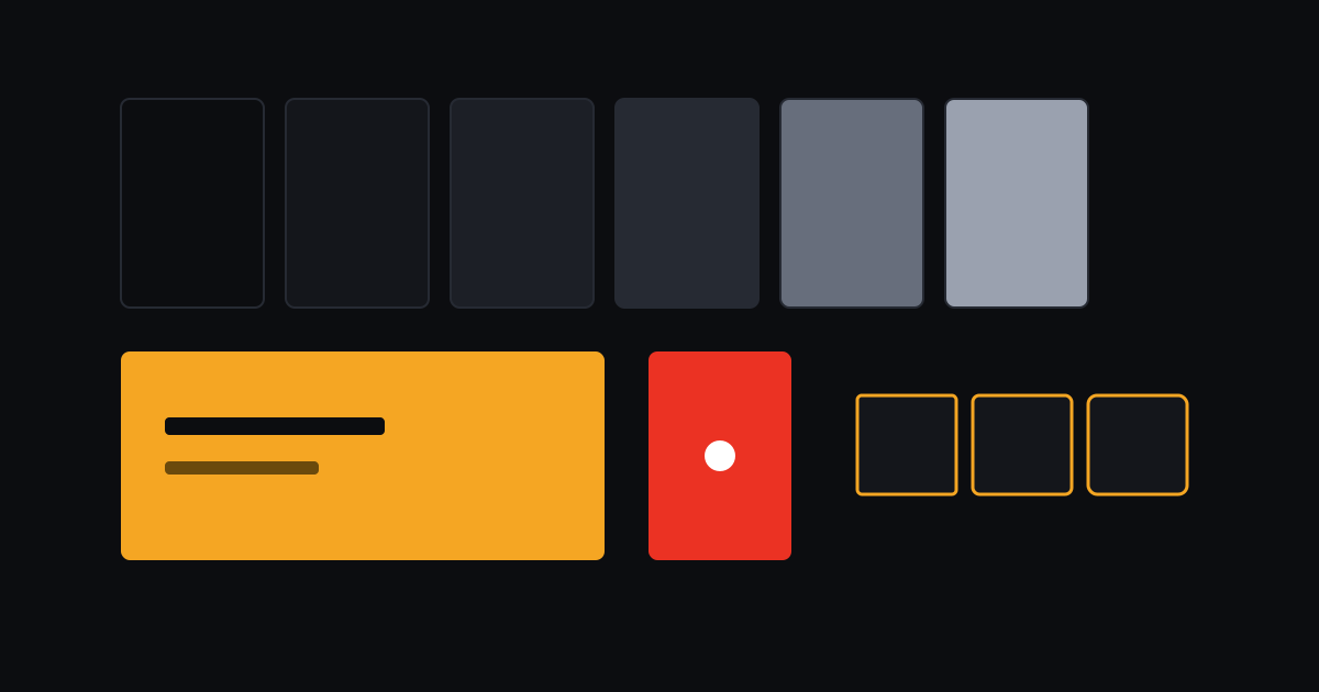
Most dashboards share a look: a purple accent, one sans-serif font, three equal cards and soft shadows. adda's design rules exist to avoid that average, and to keep the rules from eroding they are written down, and checked by a program.
Two colours with jobs
Marigold (#f5a623) is the accent: the primary button, the current tab, links. Text on a
marigold fill is dark ink, never white, because white on that yellow is hard to read.
Red (#eb3223) means live and nothing else. The LIVE badge, the pulse on a live thumbnail.
Because red is never used for decoration, seeing it tells you something is happening right now.
The one-accent, one-state-colour rule is what makes the screens readable at a glance.
Violet and purple are banned outright. So are gradients and heavy shadows: surfaces are separated by a ladder of ink shades and one-pixel borders.
Shape and type
Corners use three radii only: 4, 6 and 8 pixels. Headings use Space Grotesk, self-hosted so the page never asks a font server for anything; body text is the system font; numbers that change (viewer counts, timers, durations) are monospaced with tabular figures, so a counter does not wobble as it ticks.
Motion with a budget
Animations use springs of two lengths, 120 ms for small responses and 250 ms for state changes, and animate only transform and opacity. Nothing animates width, height or position, because those make the browser lay the page out again. Cards fade in as they scroll into view, once, and anything already on screen appears at once. With reduced motion switched on, everything is simply there.
Rules a script can check
pnpm check:design scans the web code for the banned patterns: raw hex colours in components,
off-scale radii, layout-property transitions, emoji used as icons. It runs in CI, so a pull request
that breaks a rule fails like any other test. The few legitimate exceptions, such as a chat emoji
that is user content and not an icon, are marked in the line, so each one is a decision somebody
made.
One width
Every page sits in a single centred column no wider than 1280 pixels, including the top bar and footer content. Wide monitors get margins, not stretched video. A rule that obvious still needed a component to enforce it.